Camp Glen Green Kitchen Remodel
Yellow-and-Blue Kitchen Mixes Modern Amenities with Vintage Charm
Content lovingly modified from houzz feature article by Bryan Anthony
Houzz Editorial Staff; writer, design enthusiast, reader, avid traveler
February 11, 2020
So many people have nightmare stories about kitchen remodels. Not us I am very happy to report. The decision whether or not to hire a designer is the first thing homeowners deal with. We did and it was the smartest (and first thing) we did. Alison Glen is brilliant, and a complete joy to work with. She guided us through our toughest choices, and had several genius ideas we never would have thought of on our own.
Our Contractor, Gary Stein was also fantastic. Gary was one of four contractor’s we interviewed. He was highly recommended by Jeff Bonnema, our amazingly talented Cabinet Maker. They work together on the TV show “Restored”. Gary didn’t present the lowest price, but he worked hard with us to refine and clarify the scope so we could get to a number we both felt comfortable with. The daily communication was great, and every one of his craftsmen were excellent at their skills. I baked goodies for them every day out of my Garage Kitchen (a Breville countertop oven), and the team was always appreciative. We actually had a lot of fun and we miss him.
A vintage stove, encaustic cement floor tiles and a breakfast banquette star in this cheerful Los Angeles space.
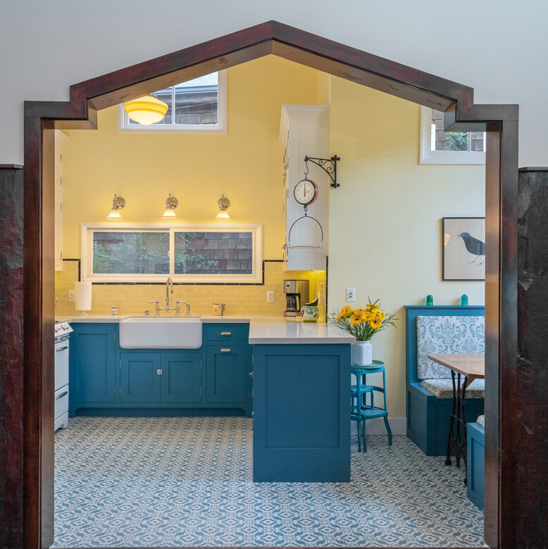
After fifteen years of dreaming, the fall of 2019 finally brought us the kitchen remodel of our dreams. We two Los Angeles homeowners didn’t want a standard all-white kitchen. Instead, we wanted a cheerful, colorful space that would mix vintage character with modern amenities, like a French door refrigerator by Dacor (made in Los Angeles!).
Kitchen at a Glance
Who lives here: A couple and their two huskies
Location: Beachwood Canyon, Los Angeles
Size: About 250 square feet
Designer: Alison Glen of LA Dwelling
Design Plan
Utilizing the original floor plan, designer Alison Glen combined the bold cement tile flooring with cabinetry and retro hardware, new countertops and backsplash; updated our built-in breakfast banquette; and worked in vintage accessories we love to create a timeless look.
Joon & Sulli love the cool new Tesselle Tile floor
Desperately Needed Updates
The original linoleum flooring in the kitchen, while classic and of the time the house was built, had really grown worn and developed cracks from water damage. We went through endless ideas and samples before we found Alison. Joyfully the decision was made to go with encaustic cement tiles. “The floor tiles were the first material selected for the remodel,” Glen says. “The gorgeous color and pattern of the Tesselle Kalikoe (Lorne) tiles helped to inform the rest of the design.” Alison also made us aware of the once a year program through Tesselle to purchase tiles directly from the manufacturer at a 40% discount. We made this purchase well ahead of the demolition.
The Stove Must Stay!
My main mandate was to keep our 1953 O’Keefe & Merritt stove. I have won three KCRW Pie Contest ribbons baking with this treasure and it was not going any where. Alison agreed, noting “These stoves are like tanks, and they’re much easier to fix than many of the new ones out there.”
What we did not have before was an exhaust fan. We love the retro hood we selected and how it’s style mirrors that of the of the stove and integrates with the new cabinets.
Some Modern Amenities
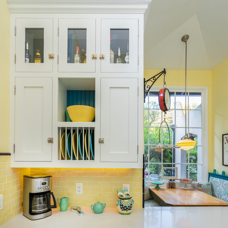
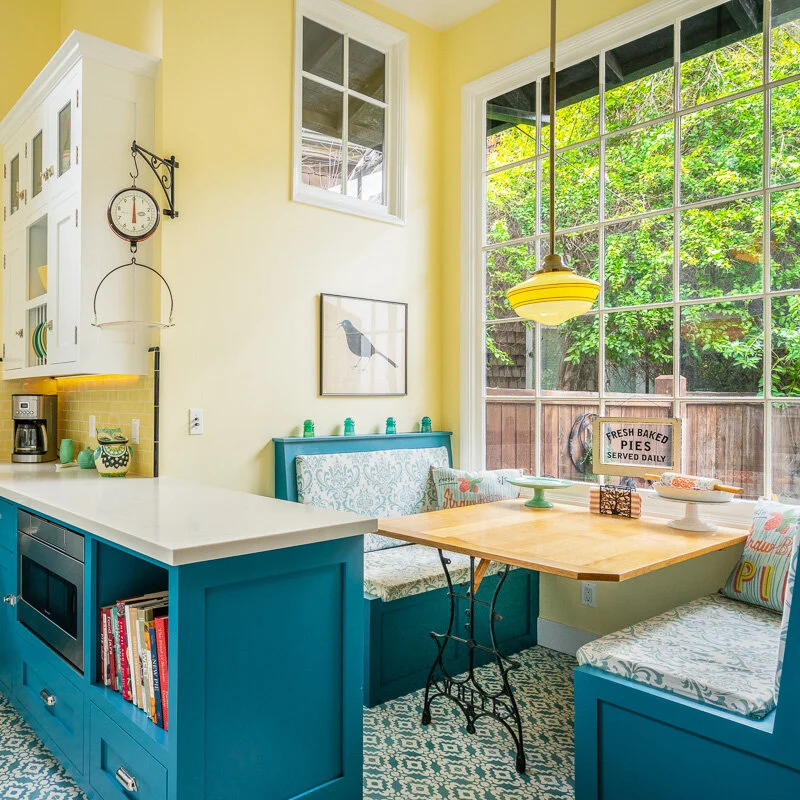
A custom white refrigerator panel and upper cabinets with vintage-inspired latch hardware complement the classic white stove. The lower cabinets in a bold blue were selected to coordinate with the floor tiles. Glen added a built-in microwave and a bookshelf to the lower cabinets. The countertops are an off-white quartz.
The upper cabinet on the wall opposite the gas range has glass doors on the top shelf; it serves as a liquor cabinet. The built-in plate rack below has a beadboard backing painted the same blue as the lower cabinets.
We loved the original shade of yellow on the walls, so we had the color matched by our paint color consultant friend Emma Stark and added a fresh coat. “It’s a cheerful color that makes the space feel happy and bright,” Glen says.
Getting to the correct color of blue for the cabinets was a lengthy process of sample test painting - and repainting, until we finally settled on Silken Peacock by Sherwin Williams.
Fitting Retro Charm
The original built-in breakfast banquette received a new coat of paint that matches the lower cabinets and new upholstery that complements the floor tiles. A collection of vintage glass electrical insulators runs along the tops of the bench backs, and a retro pendant light adds a warm glow above the custom wood breakfast table. We refinished the table top, stripping it down to reveal the beautiful cortisone oak and replaced the table support with an antique White Sewing Machine leg that had been sitting out in the garden since we moved in. Both the current and previous home owners were in the garment business, whose lines were born here at Camp Glen Green.
Our kitchen is really small and adding to the square footage was not an option, nor would it have been affordable. It feels like there is so much more space now. Alison’s cabinet design truly draws your eyes upward. She said it would, but we were afraid it the kitchen would seem smaller, having cabinets replace the open shelves. I still marvel at it every day.
My happy place : )
Credits
Designer: Alison Glen of LA Dwelling (alison@ladwelling.com)
Photos: Mario Peixoto Photography
Cabinets: Bonnema Cabinets (jdbonnema@att.net)
Contractor: Stein Construction LLC (gstein09@gmail.com)
Cement Tile: Tesselle (kjeske@tesselle.com)
Ceramic Tile: Discount Tile Center
Lighting: Rejuvenation
Window: Revival Arts Restoration, LLC (kevin@revivalarts.net)
Paint: Blue Cabinets = Sherwin Williams Silken Peacock
Paint: White cabinets + trim = Benjamin Moore Chantilly Lace, yellow walls = Benjamin Moore Lightning Bug sourced from Jill’s Paint
Appliances: Universal Appliance (maida@uakc.com)
Color Consultant: Emma Stark, Muralist and Faux Finish Artist (emma.e.stark@gmail.com)


